Before flashy 3D renders and minimalist digital thumbnails, game boxes were art.
They sat proudly on store shelves, shouting for your attention — a splash of color, a promise of adventure, a gateway into another world.
But if you’ve ever compared the Western and Japanese versions of the same retro game, you’ve probably noticed something:
The Japanese box art almost always looked better.
From hand-painted illustrations to stylized typography and emotional storytelling, Japanese covers had soul. They weren’t marketing tools; they were artistic statements.
At Oldies Nest, we explore why Japanese box art outshines its Western counterparts — and what it reveals about culture, design, and the heart of retro gaming.
The Era of Illustration: Before Marketing Took Over
In the 1980s and 1990s, video game box art was the first impression. There were no trailers, screenshots, or influencer reviews — just a 6×9-inch canvas trying to sell imagination.
Japanese designers approached that canvas like painters, not advertisers.
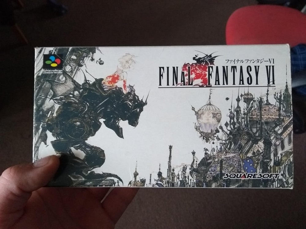
Take Final Fantasy VI: in Japan, Yoshitaka Amano’s ethereal watercolor of Terra atop a Magitek Armor symbolized melancholy and grandeur. In the West? A generic logo on a black background.
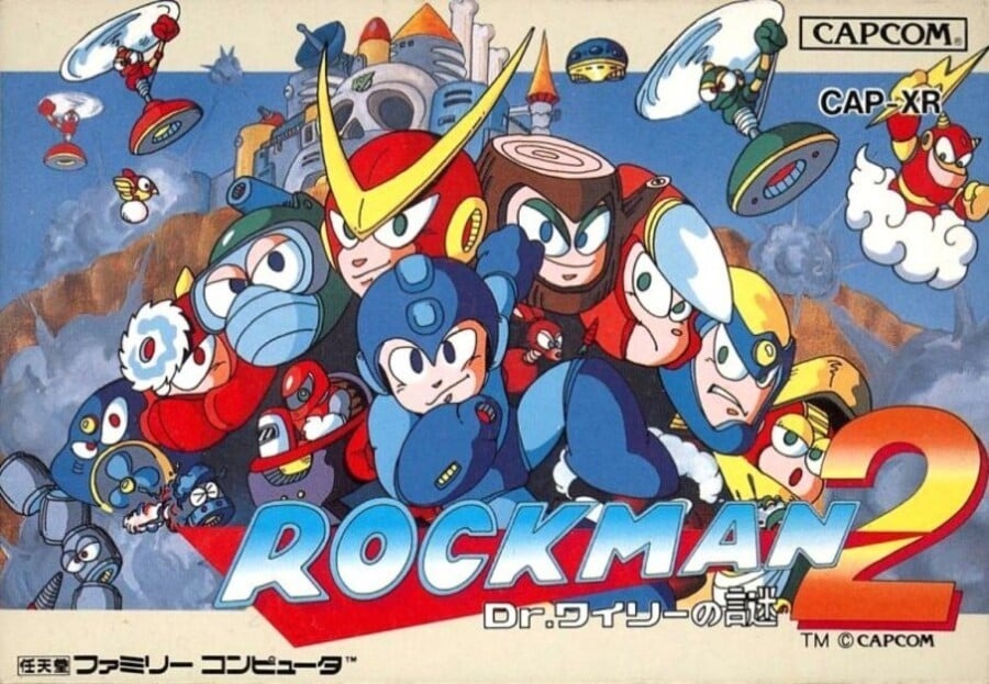
Or Mega Man (1987), where the U.S. version featured a clunky, middle-aged man in spandex — while Japan’s Rockman cover showed a charming, heroic blue robot bursting with life.
It wasn’t just about aesthetics. It was about understanding the audience.
Cultural Lens #1: Art as Emotion vs. Art as Commerce
Japan’s Approach: Expression and Atmosphere
In Japanese culture, art often expresses feeling over realism. From ukiyo-e prints to manga, emotion, composition, and tone matter more than literal depiction.
Japanese box artists treated covers as emotional extensions of the game world. The focus was on:
- Mood and mystery, not clarity
- Character emotion and movement
- Painterly techniques reminiscent of anime and fine art
Each cover felt like an invitation — a whisper rather than a shout.
The West’s Approach: Selling Power and Action
Meanwhile, Western marketing in the ’80s leaned on movie-poster logic: bigger muscles, louder colors, and explosions.
Publishers believed American kids needed intensity and realism — even when the game itself was cartoony.
That’s how you ended up with absurdities like Phalanx (SNES, 1992) — a sci-fi shooter with an old man playing a banjo on the cover. (True story.)
Cultural Lens #2: Respect for Artists
Japanese companies often credited and celebrated the illustrators behind their covers. Artists like:
- Yoshitaka Amano (Final Fantasy)
- Akira Toriyama (Dragon Quest)
- Katsuya Terada (Zelda II: The Adventure of Link)
Their styles became synonymous with the games themselves. Fans collected their artbooks, not just the games.
In contrast, Western art was often outsourced or uncredited, seen as marketing collateral rather than creative collaboration.
This difference in artistic respect shaped not only the quality of design but also the emotional bond between players and visual identity.
The Power of Minimalism
While Western box art aimed to explain, Japanese art trusted you to feel.

Take The Legend of Zelda (Famicom Disk System, 1986): simple gold background, bold Hylian crest. Elegant and mysterious. The Western NES version, meanwhile, featured a segmented shield and literal key, sword, and heart icons.
The Japanese version said, “This is a legend.”
The Western one said, “This is a game about swords.”
Minimalism made Japanese covers timeless — you can print them on a T-shirt today, and they still look fresh.
Typography: The Unsung Hero of Design
Japanese typography carries rhythm and harmony. The mix of kanji, katakana, and Latin characters allows natural balance and motion within the layout.
Box designers used vertical spacing, curved alignment, and brushstroke-style fonts to complement the imagery.
Compare that to the loud, chunky Western fonts of the ’80s — often distorted, shadowed, or awkwardly stretched. The difference is night and day.
Typography wasn’t an afterthought in Japan; it was part of the composition, like brushwork in a painting.
Case Study 1: Chrono Trigger
- Japanese Cover: Dreamlike tableau — Crono, Marle, and Frog frozen mid-battle, surrounded by painterly snow. You feel motion and emotion.
- U.S. Cover: Cropped and flattened version of the same art, overexposed and logo-heavy.
The Western edit reduced storytelling to branding. The Japanese version felt like an invitation to journey.
Case Study 2: Castlevania III: Dracula’s Curse
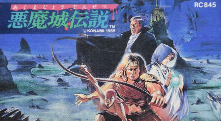
- Japanese (Famicom): Dynamic composition of Trevor Belmont facing Dracula’s castle, with intricate linework and warm gothic tones.
- U.S. (NES): Oversaturated reds and awkward perspective — Dracula looks like a gym instructor in a cape.
Again, cultural contrast: Japan sold atmosphere, the U.S. sold adrenaline.
Case Study 2: Castlevania III: Dracula’s Curse
- Japanese (Famicom): Dynamic composition of Trevor Belmont facing Dracula’s castle, with intricate linework and warm gothic tones.
- U.S. (NES): Oversaturated reds and awkward perspective — Dracula looks like a gym instructor in a cape.
Again, cultural contrast: Japan sold atmosphere, the U.S. sold adrenaline.
The Collector’s Perspective
Today, Japanese box art has become a collectible subculture of its own.
Retro collectors worldwide hunt for Famicom, Super Famicom, and PC-Engine versions of games solely for the cover designs.
As we explored in Why Physical Media Still Matters for Retro Games, holding a Japanese box isn’t just owning a product — it’s preserving a piece of design history.
The tactile experience — the soft matte finish, the foldout inserts, the compact form factor — all reflect a cultural love for craft.
Even indie developers today, especially in retro-inspired scenes, mimic this aesthetic for their limited-edition releases.
The Emotional Language of Color
Japanese covers used color as emotion, not decoration.
- Soft pastels conveyed dreamlike serenity (Kirby’s Adventure).
- Muted tones built tension and atmosphere (Shin Megami Tensei).
- Gold and red palettes implied epic scale (Zelda and Fire Emblem).
Western designs, conversely, often leaned on primary contrasts — bright reds and blues that demanded attention but aged poorly.
Japanese covers aged gracefully because they invited curiosity instead of shouting for it.
Box Art as Cultural Mirror
Japanese box art reveals a society that values harmony, storytelling, and respect for imagination.
Western art of the same era reflects a market-driven mindset — sell fast, sell loud.
Neither is inherently wrong, but the Japanese approach gave games a visual identity that transcended time.
Even decades later, those covers still feel cohesive with the games they represent — expressive, symbolic, and human.
Preservation and the Lost Art of Packaging
With digital distribution dominating, box art is fading — a casualty of convenience.
But fans and historians are fighting back, scanning and archiving thousands of covers from the Famicom, Saturn, and PlayStation eras.
As noted in Retro Game Preservation: Why It Matters, these efforts aren’t just about nostalgia — they’re about saving visual heritage.
Because every box tells a story, not only about the game but about the people and philosophies behind it.
Conclusion: A Canvas of Imagination
Japanese box art wasn’t better just because it looked prettier — it was better because it believed in you.
It trusted your curiosity, your imagination, your ability to interpret emotion through color and composition.
Where Western art said, “Here’s what happens,” Japanese art said, “Here’s how it feels.”
That emotional honesty — born from cultural reverence for beauty and craft — turned mere packaging into timeless icons.
So the next time you browse a shelf or scroll an emulator menu, remember: those little rectangles of art were once portals.
And somewhere, beneath the layers of plastic wrap and kanji lettering, the spirit of retro design still whispers:
“Come see what dreams look like in color.”